In this tutorial, we shall be able to create Normal Inverse curves from the formula given below (IEC). This formula has been used in so many coordination studies world wide. You can actually use it to coordinate your protection settings with your power supplier. Normally the time setting for the network protection will be provided by the power supplier. We shall be discussing this on the next tutorial.

Time-Current Formula
where
k = time, s
α, β = constants, see table below
I = Input Current
IO = Pickup setting
The curve constants for the different response curves are as follows.
| α | β | |
|---|---|---|
| Normal Inverse (Type A) | 0.02 | 0.14 |
| Very Inverse (Type B) | 1.00 | 13.5 |
| Extremely Inverse (Type C) | 2.00 | 80.0 |
| Long Time Inverse | 1.00 | 120 |
Using the formula above, the resulting values will be the following table. You could copy the whole table and paste it into your worksheet or create the values yourself using the above formula. Remember that this curve is for Normal Inverse curve.
| I/IO | I (A) | 0.05 | 0.10 | 0.20 | 0.25 | 0.30 | 0.40 | 0.50 | 0.60 | 0.70 | 0.80 | 0.90 | 1.00 |
|---|---|---|---|---|---|---|---|---|---|---|---|---|---|
| Time, s | |||||||||||||
| 1.5 | 750 | 0.86 | 1.72 | 3.44 | 4.30 | 5.16 | 6.88 | 8.60 | 10.32 | 12.04 | 13.76 | 15.47 | 17.19 |
| 2.0 | 1000 | 0.50 | 1.00 | 2.01 | 2.51 | 3.01 | 4.01 | 5.01 | 6.02 | 7.02 | 8.02 | 9.03 | 10.03 |
| 3.0 | 1500 | 0.32 | 0.63 | 1.26 | 1.58 | 1.89 | 2.52 | 3.15 | 3.78 | 4.41 | 5.04 | 5.67 | 6.30 |
| 4.0 | 2000 | 0.25 | 0.50 | 1.00 | 1.24 | 1.49 | 1.99 | 2.49 | 2.99 | 3.49 | 3.98 | 4.48 | 4.98 |
| 5.0 | 2500 | 0.21 | 0.43 | 0.86 | 1.07 | 1.28 | 1.71 | 2.14 | 2.57 | 3.00 | 3.42 | 3.85 | 4.28 |
| 6.0 | 3000 | 0.19 | 0.38 | 0.77 | 0.96 | 1.15 | 1.53 | 1.92 | 2.30 | 2.69 | 3.07 | 3.45 | 3.84 |
| 7.0 | 3500 | 0.18 | 0.35 | 0.71 | 0.88 | 1.06 | 1.41 | 1.76 | 2.12 | 2.47 | 2.82 | 3.17 | 3.53 |
| 8.0 | 4000 | 0.16 | 0.33 | 0.66 | 0.82 | 0.99 | 1.32 | 1.65 | 1.98 | 2.31 | 2.64 | 2.97 | 3.30 |
| 9.0 | 4500 | 0.16 | 0.31 | 0.62 | 0.78 | 0.93 | 1.25 | 1.56 | 1.87 | 2.18 | 2.49 | 2.80 | 3.12 |
| 10 | 5000 | 0.15 | 0.30 | 0.59 | 0.74 | 0.89 | 1.19 | 1.49 | 1.78 | 2.08 | 2.38 | 2.67 | 2.97 |
| 20 | 10000 | 0.11 | 0.23 | 0.45 | 0.57 | 0.68 | 0.91 | 1.13 | 1.36 | 1.59 | 1.81 | 2.04 | 2.27 |
With the values above, We shall be using the 2003 version of Excel to draw the chart. If you have 2007 version, it is not a problem, the steps would just be different but the resulting graph will still be the same.
Step 1
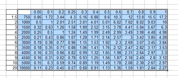
Select the cell range as shown.
Note: Do not include the I/IO, else you will be getting a different graph profile.
Step 2
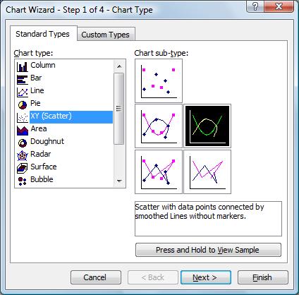
Start chart wizard and select XY (Scatter) with data points connected by smoothed lines without marker.
Step 3
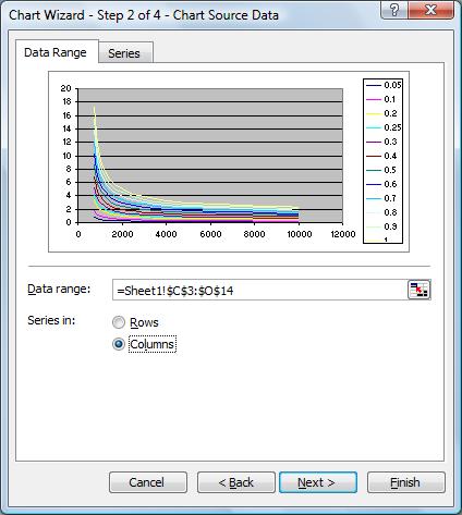
Select the data range with series in columns
Step 4
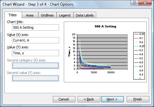
Type a title, make sure to put x-axis title as Current in amperes and y-axis values as time in seconds.
Step 5
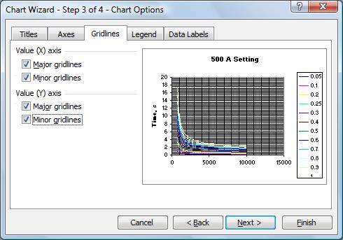
Click the gridlines tab and tick all the major and minor gridlines for X and Y axis. Then click finish. If prompted about the location of the graph, select it as an object in the worksheet.
Step 6
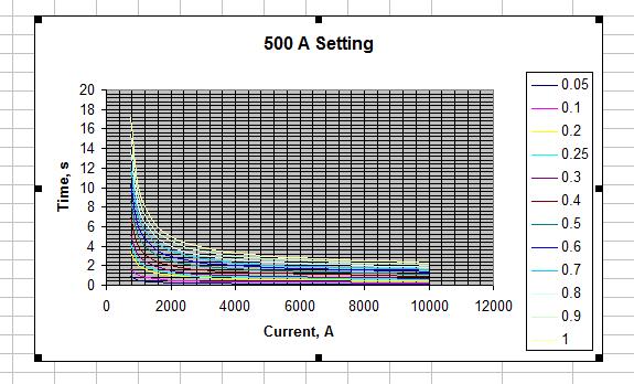
The resulting graph will be
Step 7
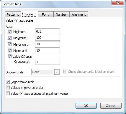
Double click on the Y-axis values, the format Y-axis window will pop-up. Select Logarithmic scale. and values as shown. Do similar for the X-axis.
Step 8
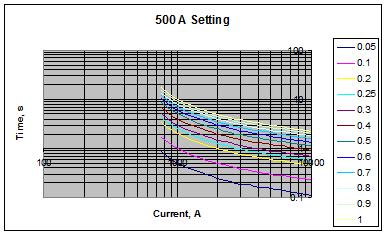
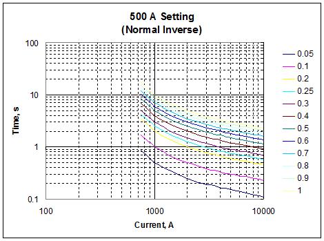
The resulting graph will be as follows. As you could see, the graph scale now are logarithmic.
Step 9
Try format the graph, putting some additional values, removing the chart background, etc. The final graph may look like this.
Next time